Showing posts with label Vertical bar. Show all posts

Tuesday, January 25, 2022

IELTS Task 1 - Vertical Bar Graph: Men and women in further education in Britain

WRITING TASK 1

You should spend about 20 minutes on this task.

The chart below shows the number of men and women in further education in Britain in three periods and whether they were studying full-time or part-time.


Summarise the information by selecting and reporting the main features, and make comparisons where relevant.


The chart below shows the number of men and women in further education in Britain in three periods and whether they were studying full-time or part-time.

The vertical bar chart illustrates the number of men and women in further full-time and part-time education in Britain from 1970 to 1990. The data is reported in thousands.

From an overall perspective, it is apparent that the number of men and women pursuing full-time education has steadily increased over two decades. While there were twice as many men as women in 1970, women surpassed enrollment figures a decade later. It is notable that by 1990, both men and women reported equal numbers at nearly 300 thousand.

Upon closer observation of part-time pursuing student trends, it is interesting that while full-time male students had a steady rise over two decades, part-timers had a gradual decline and reported a loss of about 100 thousand students. On the flip side, female students had an exponential growth by 1990 and, combined with their full-time counterparts, accounted for the highest number of students enrolled in further education overall.

To summarize, from a trend perspective, full-time and part-time student numbers have swelled up over two decades.

IELTS Task 1 (Graphs) Sample Solutions

IELTS Task 2 (Essays) Sample Solutions

IELTS Task 1 - Vertical Bar Graph: Student enrollment in Ahmadu Bello University, Nigeria

The vertical bar graph depicts the number of male and female students enrolled in six different courses in Ahmadu Bello University, Zaira, Nigeria.

The six courses in order of overall signup numbers are - Engineering, Language/Education, Arts, Science, Computing and Medicine/Pharmacy. From a broad perspective, it is noticeable that the maximum male students enrolled for Engineering with 520 admissions. Meanwhile, female students preferred Language/Education at 450. While Engineering had less than half female enrollment, we observe a similar trend for men in Language/Education.

Moving further, the least preferred course for both men and women was Medicine/Pharmacy at 80 and 50. Computing and Sciences fared slightly better but remained the bottom three choices amongst the six courses. Female registration in Arts and Engineering was approximately similar. One hundred fifty male students enrolled for Science while females enrolled at 20 less than males.

In a nutshell, maximum male and female enrollment were in Engineering and Language/Education respectively.

IELTS Task 1 - Vertical Bar Graph: Weekly leisure hours for men and women

The vertical bar chart portrays the number of hours of leisure enjoyed by men and women in a typical week in 1998-99, according to gender and employment status. The data is calibrated in hours.

From an overall perspective, it is apparent that among those employed full-time, men on average had 50 hours of leisure, whereas women had approximately 37 hours. There were no figures for male part-time workers, but female part-timers had 40 hours of leisure time, only slightly more than women in full-time employment, perhaps reflecting their work in the home.

Stating further, as expected, both unemployed and retired people relished upwards of approximately 90 leisure hours per week, closely followed by females at about 80. Lastly, female homemakers enjoyed approximately 54 hours of leisure, while no figures were reported for their male counterparts.

Overall, for the reported categories, men enjoyed slightly more leisure time than women.

IELTS Task 1: Vertical Bar Graph: Home activities among young children in four countries

The vertical bar graph depicts four different home activities among young children in Malaysia, China, Nigeria and Sudan. The data is calibrated in percentage.

From an overall perspective, it is apparent that Computer Games are the most popular home activity in all four countries, with Nigerian kids preferring it the most at 60%, closely followed by Malaysian and Sudanese at 50% each. Comparatively, only 40% of Chinese kids prefer games. It is also noticeable that watching TV is equally preferred at 30% in all four countries.

Moving further, it is evident that the least popular home activity is Reading, with a 20% preference in Malaysia and a mere 10% for both Nigeria and Sudan. Sudanese children report a 30% choice for board games, followed by 25% for Malaysia and China.

Overall, Computer Games are the most popular and Reading is the least preferred home activity in all four countries.

Note!: Since there is no mention of the year in the given graph, you may use the present tense or the past tense.
Either of them would be correct.
However, a few people may believe that since the survey has already been taken, the past tense should be used. If that is the case, you may write this in the past tense for your own satisfaction. :)

Monday, January 24, 2022

IELTS Task 1 - Vertical & Line Chart: Weekly fast food consumption trend in Britain


The vertical bar graph depicts the expenditure on fast foods by different income groups in Britain, and the line graph shows the trends in consumption of fast foods from 1970 to 1990.

The first graph shows that high-income earners consumed considerably more fast foods than the other income groups. They spent more than twice as much on hamburgers (43 pence per person per week) as on fish and chips or pizza (both under 20 pence). Average income earners spent 33 pence per person per week on hamburgers, which was the maximum they spent on any given fast food.

Furthermore, low-income earners spent less than other income groups on fast foods, though fish and chips remained their most popular fast food, followed by hamburgers and pizza. From the line graph, in 1970, fish and chips were the most popular fast food whereas burgers and pizza were the least popular.

Overall, there was a sharp rise and gradual decline in the consumption of hamburgers, pizza, and fish and chips respectively over the 20 years.

Sunday, January 23, 2022

IELTS Task 1 - Vertical Bar Graph: Favourite pastime activities

WRITING TASK 1

You should spend about 20 minutes on this task.

The chart below shows the favourite pastime activities for young children.


Summarise the information by selecting and reporting the main features, and make comparisons where relevant.


The vertical bar graph reveals the preferred leisure activities of children aged 5-14. The data is calibrated in percentage.

Out of the children surveyed, it is apparent that watching TV or videos was the most preferred leisure activity. In addition to it, the second most popular activity, preferred by 80% of boys and 60% of girls, was playing electronic or computer games.

Girls rated activities such as art and craft at approximately 60%; however, only 35% of boys opted for creative pastimes. On the other hand, bike riding was almost as popular as electronic games amongst boys and nearly 60% of girls.

Only 25% of the girls voted for Skateboarding as their favourite pastime, making it the least popular amongst girls; however, it attracted the same amount as Art & Craft for boys.

Overall, watching TV or videos was the preferred pastime for both boys and girls.

IELTS Task 1 (Graphs) Sample Solutions

IELTS Task 2 (Essays) Sample Solutions

IELTS Task 1 - Vertical Bar Graph: Oil Production by Gulf Countries

WRITING TASK 1

You should spend about 20 minutes on this task.

The chart below shows the oil production for six Gulf countries from '90 to '10.


Summarise the information by selecting and reporting the main features, and make comparisons where relevant.


oil production for six Gulf countries from '90 to '10
The vertical bar graph depicts the oil production in millions of barrels per day for six Gulf countries.

From an overall perspective, it is noticeable that almost all countries' oil production had increased from 1990 to 2010. Saudi Arabia noticed the most significant rise where the production increased from 8.2 in 1990 to 14.2 in 2010. Out of all the six countries, Saudi Arabia's output remained the highest. Iran was in the second position in terms of oil production. Its oil production in 2010 was 4.2 while the figure was 1.5 less in 1990.

Iraq and UAE have similar profiles, and their production figures have been similar over the four years. Iraq and UAE's production in 2010 was approximately 2.7.

Qatar remained the lowest producer of oil with an average production of 0.2, with an exception in 2000 where the production was 0.4

In a nutshell, it is crystal clear that Saudi Arabia has always been the maximum producer of oil while Qatar has been the lowest.

IELTS Task 1 (Graphs) Sample Solutions

IELTS Task 2 (Essays) Sample Solutions

IELTS Task 1 - Vertical Bar Chart: Internet usage by age

WRITING TASK 1

You should spend about 20 minutes on this task.

The chart below shows the internet usage by age for the years 1998 to 2000.


Summarise the information by selecting and reporting the main features, and make comparisons where relevant.


internet users by age

The vertical bar graph depicts the changes in the age profile of Internet users between 1998 and 2000. The data is reported in percentage.

Overall, the primary users of the Internet were young adults between 16 and 30 years old. In 1998, they accounted for more than half of all users. Even though usage dropped by 9% within two years, they continued to be the most prominent group.

The second biggest group of Internet users aged between 31 and 50 reported a 41% usage in 1998, falling slightly to 37% in 2000. When combined with the 16-30 age group, over 94% of users in 1998 were between 16 and 50. In 1999, the number of children online quadrupled from 2% to 8%, and it continued to increase in 2000. There were similar increases for older users, rising from 4% in 1998 to 10% in 2000.

Overall, users between the ages of 16 and 50 accounted for most Internet users.

IELTS Task 1 (Graphs) Sample Solutions

IELTS Task 2 (Essays) Sample Solutions

IELTS Task 1 - Vertical Bar Chart: Fertility rate in Gulf countries

WRITING TASK 1

You should spend about 20 minutes on this task.

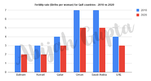
The chart below shows the fertility rate (Births per woman) for Gulf countries for the years 2010 and 2020.


Summarise the information by selecting and reporting the main features, and make comparisons where relevant.


the fertility rate (Births per woman) for Gulf countries for the years 2010 and 2020
The vertical bar chart shows the changes in the fertility rate of women in six Gulf countries - Saudi Arabia, the UAE, Oman, Qatar, Kuwait and Bahrain between 2010 and 2020. The data is reported in births per woman.

Firstly, we note an overall decline across all reported countries in the ten years. We also observe three pairs wherein the numbers and trends reported are the same for both years - Bahrain & Kuwait, Qatar & UAE, and Oman & Saudi Arabia.

While Saudi Arabia and Oman each reported seven births per woman in 2010, they saw a 33% reduction to five births within a decade. By contrast, Bahrain and Kuwait had the lowest rate at three each, eventually dropping to two. Qatar and UAE displayed similar trends, and both reported four births per woman in 2010 that declined to three by 2020.

Overall, there were significant decreases in birth rates in all Gulf countries, and Oman and Saudi Arabia had the highest fertility rate in both years.

IELTS Task 1 (Graphs) Sample Solutions

IELTS Task 2 (Essays) Sample Solutions

How to write the IELTS Graph question introduction

WRITING TASK 1
You should spend about 20 minutes on this task.

The chart below shows the reasons for studying according to the age of the students.


Summarise the information by selecting and reporting the main features, and make comparisons where relevant.


The chart below shows the reasons for studying according to the age of the students.

Sample Introduction

The vertical bar graph depicts the reasons for studying based upon the age of students ranging from under 26 to over 49. The data has been calibrated in percentage. 

Introduction Breakdown

  • The vertical bar Here I define the type of the graph.
  • graph Here I write the number of graphs. Since it's a single one, I write 'graph'
  • depicts I used a synonym for 'shows'; This is where paraphrase is used.
  • the reasons for studying based upon the age of students Highlighting what the graph is about
  • ranging from under 26 to over 49 Pick up the range from the x-axis
  • The data has been calibrated in percent This is a standard line; to be used as the last line in the introductory paragraph for majority of the graphs.

IELTS Task 1 (Graphs) Sample Solutions

IELTS Task 2 (Essays) Sample Solutions